BODY POLITIC
Packaging Project
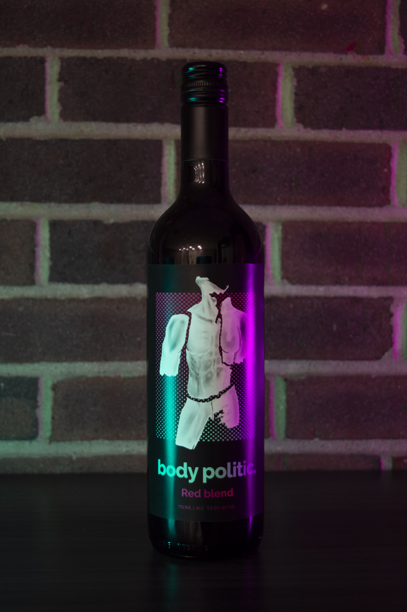
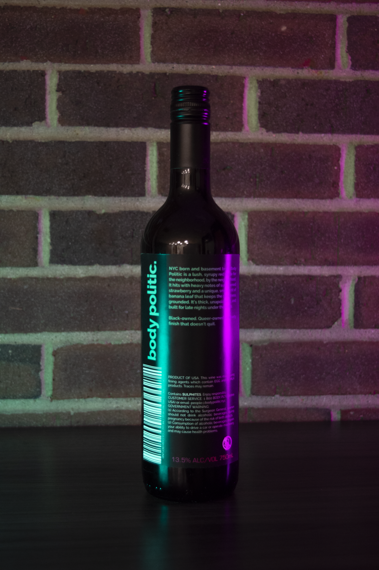
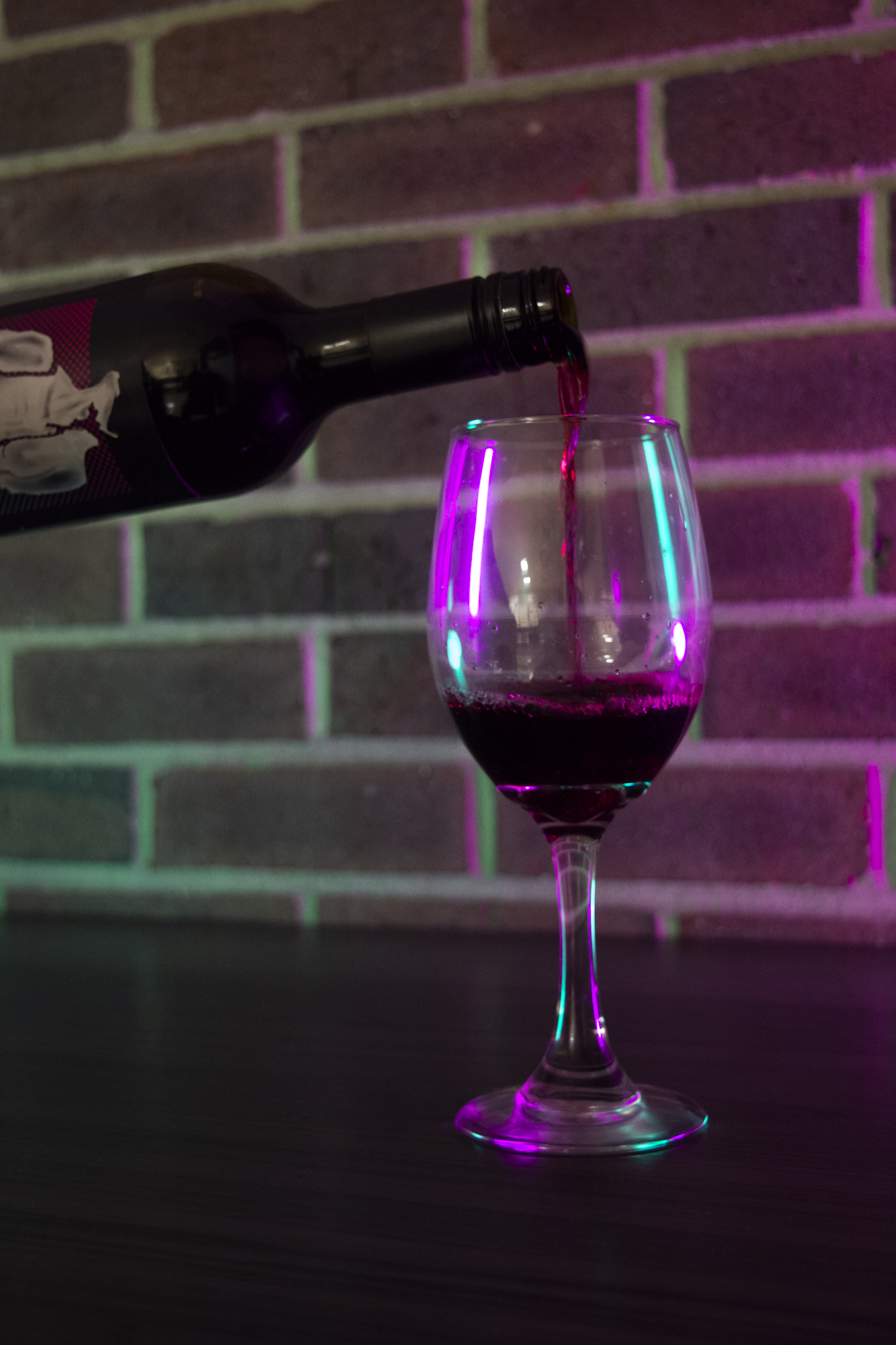
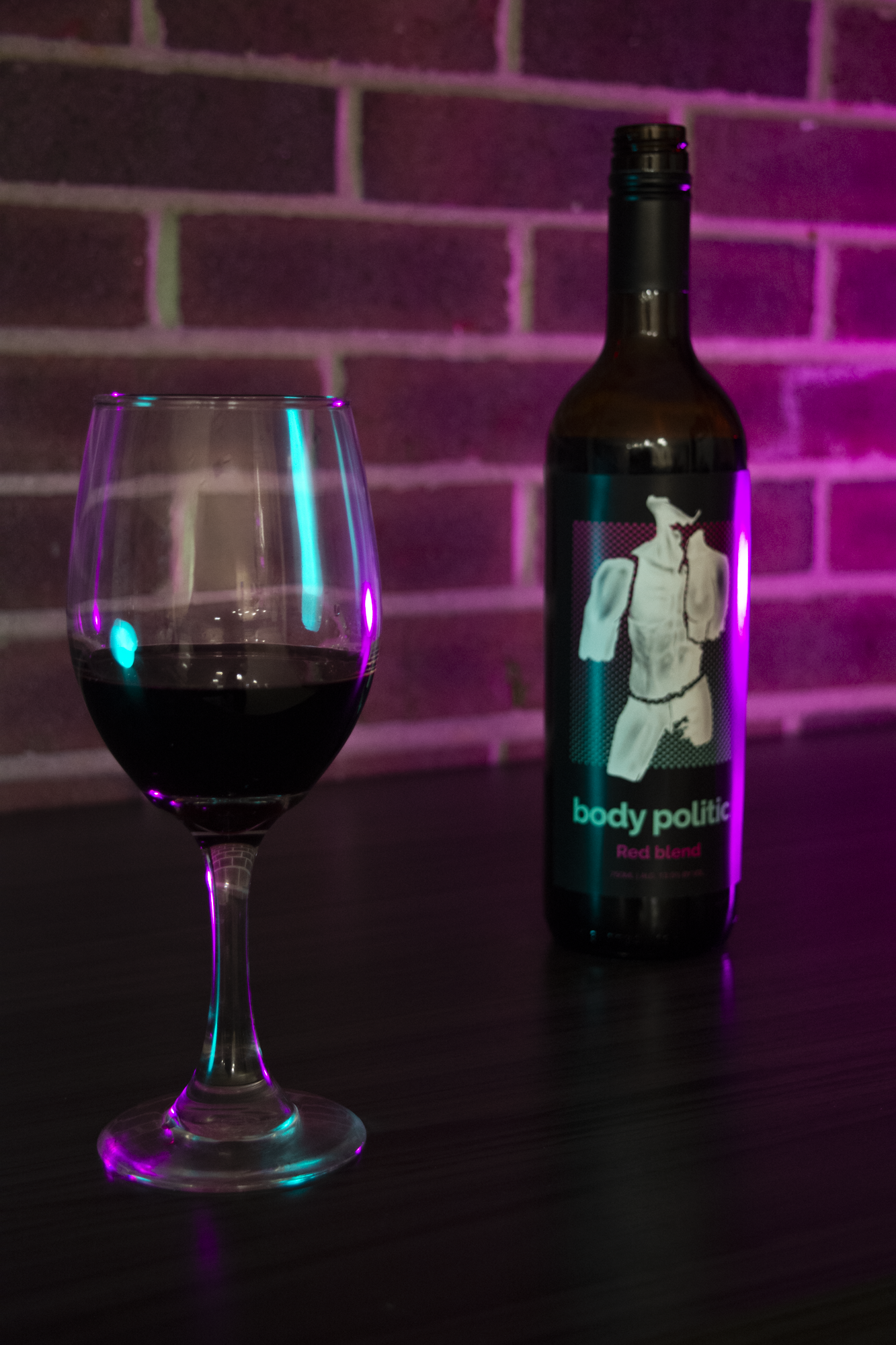
Body Politic is a fun, seductive wine brand that centers the thrill of youth, nightlife, and neon lights all at an affordable price. It’s a fruity red blend, and has all of the class of premium wine without the expense.
The conception behind the naming was to have a fun nod to how wine is referred to when discussing its taste, or its “body”. The name Body Politic in general refers to the general populace of any given town or otherwise public group under a governing body. These layered meanings, combined with the flirtatious branding, intersect to create a unique visual identity
The Imagery of the greek-like statue, broken apart and mismatched from male and female likenesses, nods to the political nature of the name, while also underlining the seduction of a light, fruity red blend.
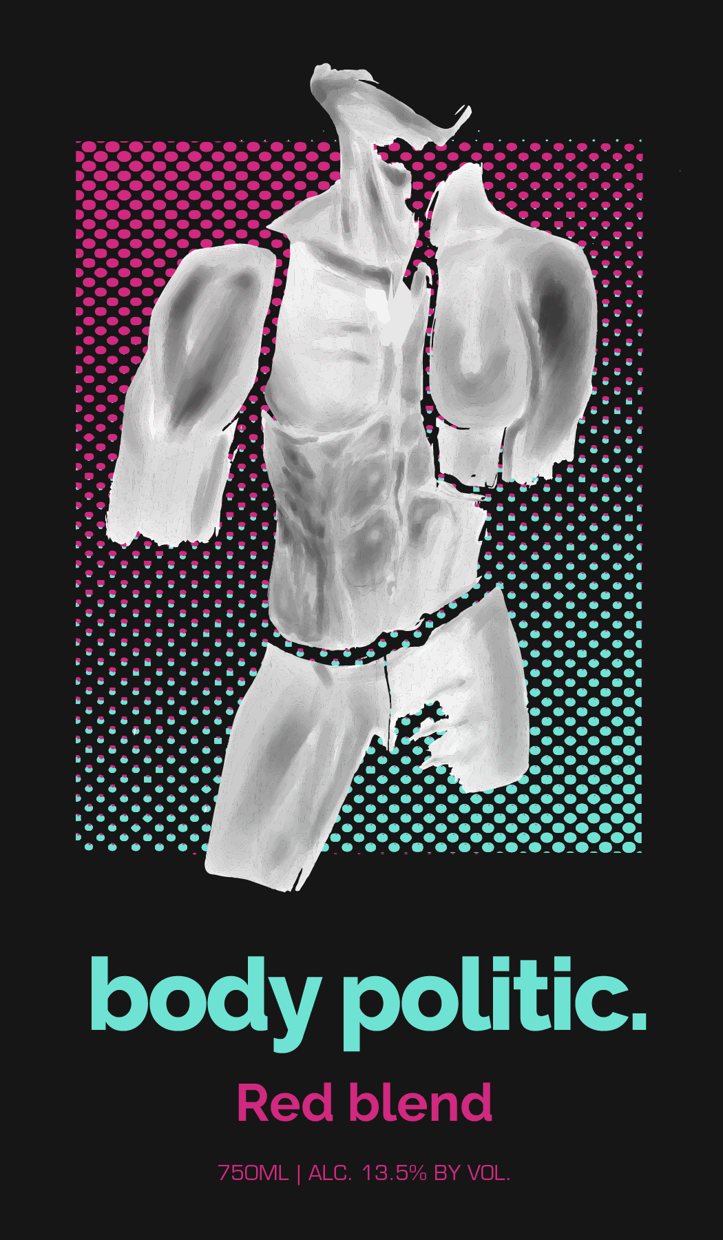
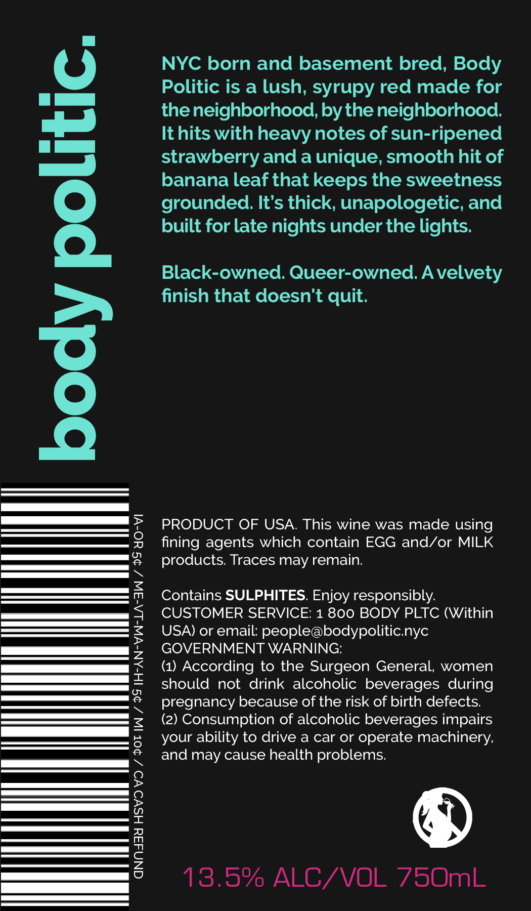
FINAL DESIGN/PHOTOSHOOT
I used a legible, uniform stroke width san serif font to make a bold, modern statement. The typography treatment, mixed with the use of neon turqoise and magenta create the backdrop the for nightlife vibe of the brand. The half tone gradient behind the statue suggests a playful environment for a playful brand.