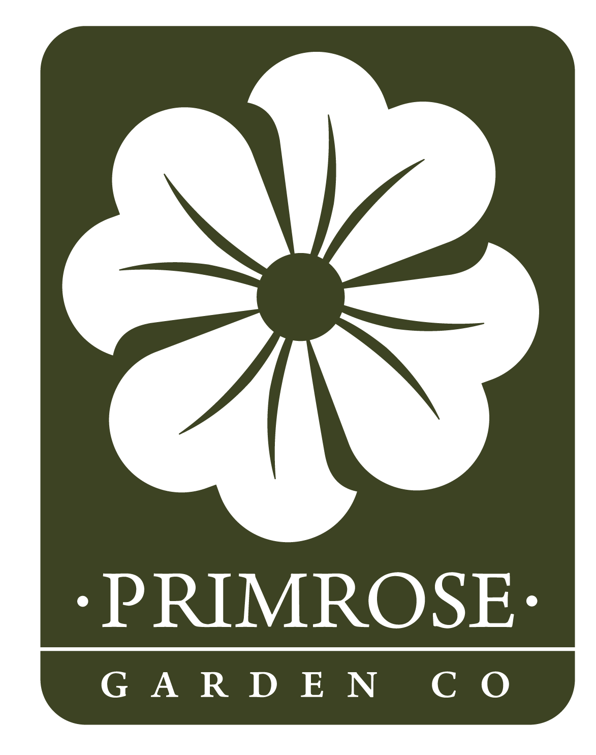
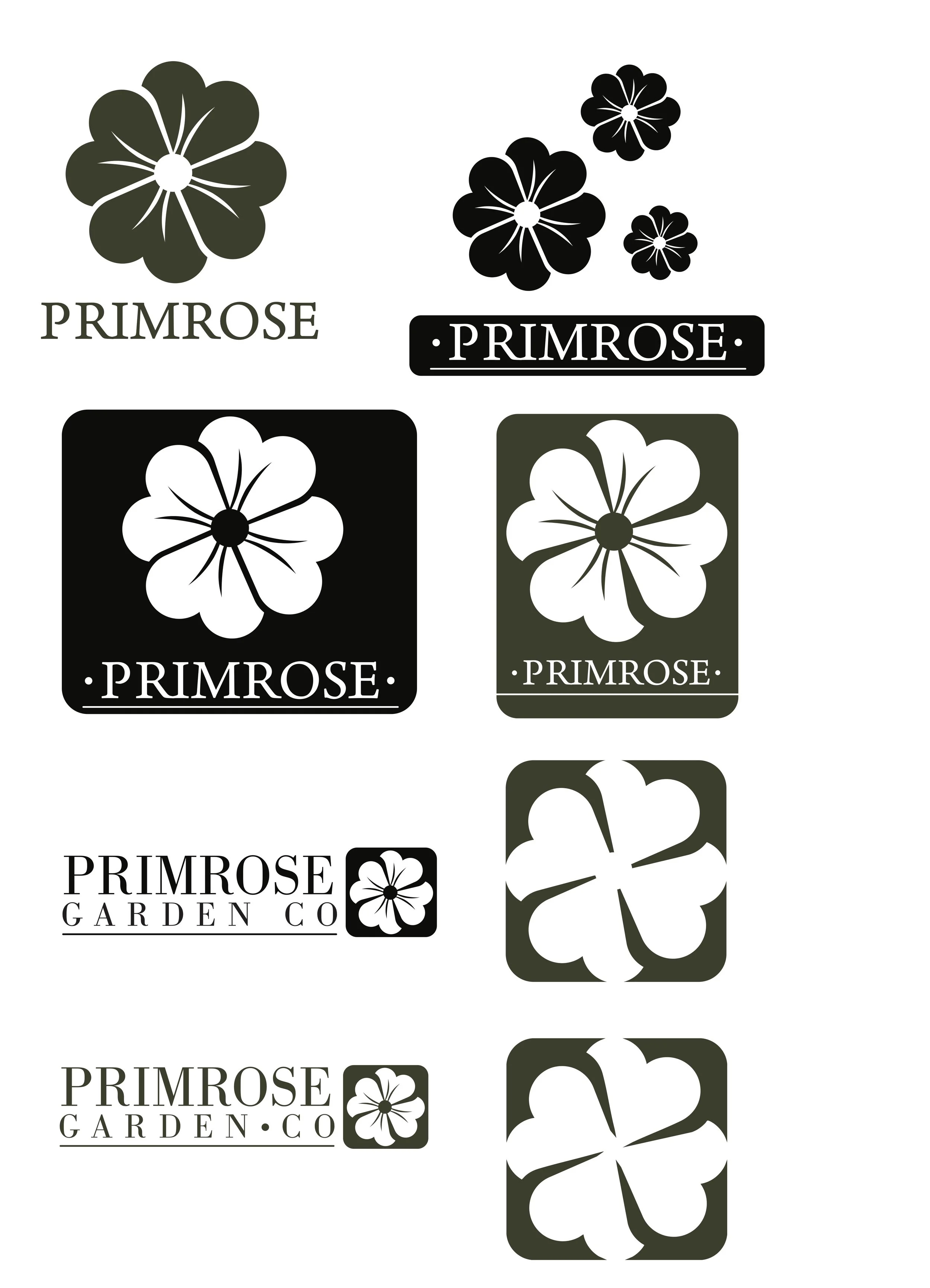
Logo Design
Primrose Garden co is a logo I designed for a landscaping and gardening business in Salt Lake City, Utah. The clients desired to express their trustworthiness and dependability, so I developed a badge with their namesake to give their company's identity a sense of sturdiness. The logo feels as though it can be a metal plaque fixed to a wall, which reinforces a sense of strength and pride in all that they do.
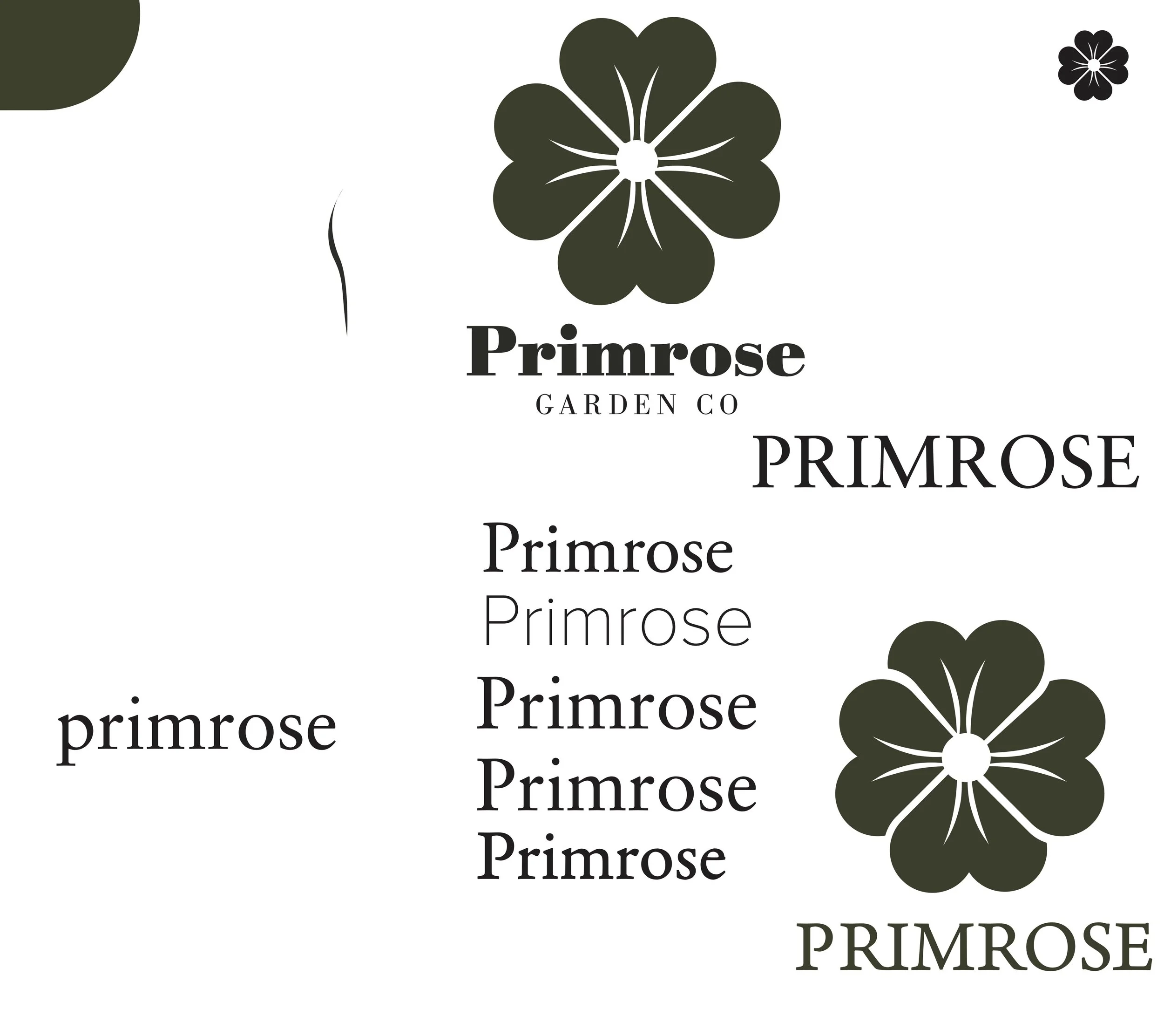
Initial prototypes
After the consultation meeting with the owners of Primrose Garden Co, I had my work laid out for me. They expressed themes of professionalism, earthy and grounded aesthetics, and reliability in their brand image, so it become priory number for me to translate that into a logo that conveys these values. Initial digital prototypes explored mostly serif type faces with different varitions of a primrose in the companies signature shades of deep green.
primrose garden co
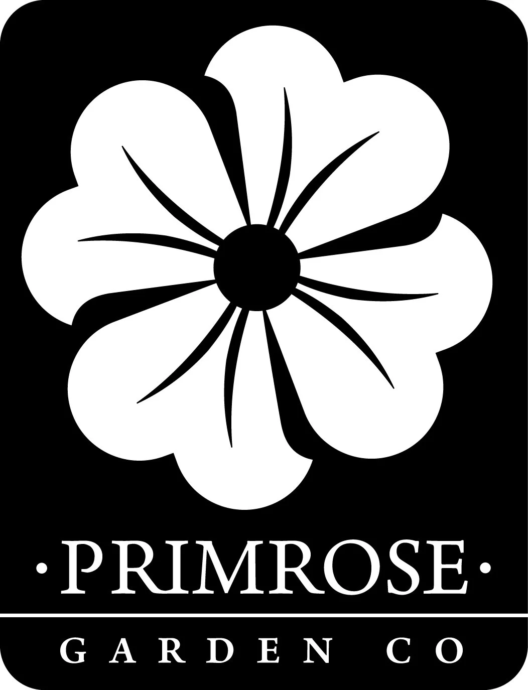
Final Design
For my final logo and word mark, I settled on a badge with the negative space representing the primrose and company name respectively. It was meant to resemble a metal plaque to invoke a sense of reliability, strength, and heritage; all things that professional landscapers need in order to be successful.